Diane Yamada

Summary —

  • Role: Visual Designer
  • Timeframe: January 2017 - February 2018
  • Deliverables: presentation decks, case studies, white papers, architecture diagrams, website designs (wireframes and mocks), email designs, SVG animations
  • Software used: Google Slides, Adobe InDesign, Adobe Illustrator, Adobe Photoshop, Adobe AfterEffects, Figma

Defining the Brand

At Amperity, I had the opportunity to influence and design the first evolution of the brand.

I was the only visual designer at the company at the time, and I collaborated with marketing and leadership teams to come up with a new visual language for the company. 

amperity-old-designs_2.png

Before

Amperity's design language at the time was dark and heavy. The logo had already been created, but the company was still in its early stages - and in stealth mode.

amperity-new-designs@2x.png

After

After workshops and discussions with leadership, we decided a lighter, brighter direction more appropriately reflected the company's values.

 
Amperity Brand Style

Amperity Brand Style


Amperity's Launch Website

  • Project Timeline: June 2017 - January 2018
  • In Collaboration With: Rebecca Scully (then Marketing Manager), Aashish Dhamdhere (VP of Marketing), Scott Swanson (contracted web developer)
  • Deliverables: Information architecture, wireframes, high-fidelity mocks, SVG animations

One of the main projects I had the privilege to work on was the design and launch of Amperity's first public website out of stealth mode. The website was scheduled to release on the same day as Amperity's customer event on September 14th, 2017. 

This version of the site is no longer live as of September 22nd, 2018. The Amperity website is now in its second version and I was not a part of that project.

Wireframe iterations to the final design. 


Design process

In collaboration with the marketing team (the Marketing Manager and VP of Marketing), we developed a plan to design and execute the website over the course of the summer. I was responsible for developing the website information architecture and completing the creative deliverables, including wireframes and high-fidelity mocks.

  • Design principles were written by the marketing manager (project lead) to lay out the scope and context of the website. They were reviewed and agreed upon by the marketing and leadership teams.
  • A project timeline was crafted to ensure all deliverables were thought of and accounted for. As unexpected circumstances arose, we adjusted the timeline and resources accordingly.
  • Page goals were also written by the project lead to have a cohesive understanding of what we wanted each page to achieve. It lists out the informational and emotional goals we were aiming for, as well as any actions we were driving towards.
  • I created an information architecture chart for the website based on the page goals and artifacts we wanted to show. I grouped the content together by relevance and tried to visualize cross-linking content.
 

I used Figma to design a basic layout structure of content and visuals. Figma was the ideal platform for collaborating with the then marketing manager who was providing copy for the sections. 


After reviewing wireframes with the Marketing Manager and VP of Marketing, I started by creating several iterations of the home page to get a sense of the mood and style we wanted to achieve. After that, I applied the same layout and style scheme to the rest of the pages in the architecture. The mobile designs followed soon after.

 
Amperity Simplified Architecture Diagram

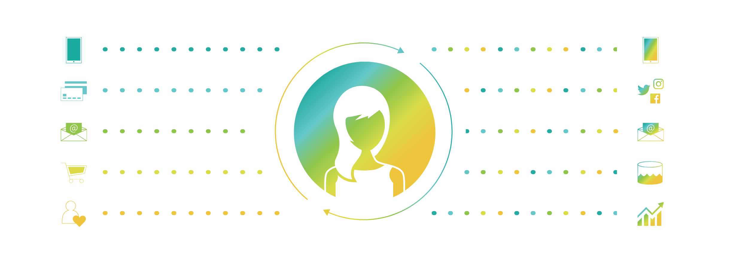
After creating draft after draft of the architecture diagram we wanted on the website, I also took the time to learn Adobe AfterEffects and SVG animations to add some motion and liveliness to the website (the above image is static but moves on the actual website).

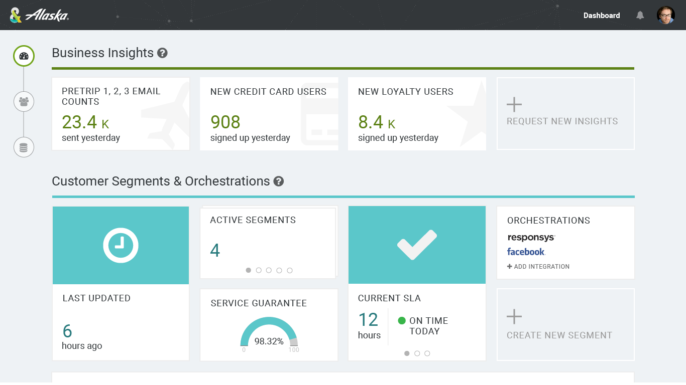
The following are various screenshots from the website.

homepage process - white@2x.png

Summary —

  • Role: UX Designer / Product Manager
  • Timeframe:  February 2018 - Present
  • Design Deliverables: wireframes, high-fidelity mocks, design flows
  • PM Responsibilities: In collaboration with other product managers:
    • quarterly and iteration planning
    • writing product specifications and documentation
  • Software used: Google Docs (and Slides, Sheets), Adobe Illustrator, Sketch

Make Something Better, Today

In February of 2018, I transitioned off the marketing team at Amperity to join the product team. Having already completed some projects with the product team before (being the only designer at the company meant you got to do a bit of everything), it was a natural and exciting transition to make.

In addition to creating wireframes and mocks for UI enhancements, I also took on some product management responsibilities due to the fact that I was already working closely with the UI developers. I began to be more involved in quarterly planning, plan iterations, and run daily scrum stand-ups for the team.

Not all of my design work has come to life, but the following are some examples of my deliverables.

Customer Dashboard

IMG_4493.jpg

wireframes

One of my earliest projects for the product team was to design a dashboard for customers. We wanted to communicate the value of the Amperity product and really show them the impact of the work we were doing. 

draft.jpg

First Draft

This was an early first draft of the customer dashboard 

Summary —

  • Role: UI Designer (contract through The Creative Group, Innominds)
  • Timeframe:  December 2015 - January 2017
  • Design Deliverables: presentation decks, high-fidelity mocks
  • Software used: Adobe Illustrator

A Single Source of Truth

At Microsoft, I worked with a team of project managers and other contract designers to design software for telesales and field sales to improve their workflow. Sellers spend a lot of time researching and gathering information about clients before going into meetings - most, if not all, is done manually. They check system after system for different pieces of information to pull together into a cohesive story. 

This particular team wanted to develop a web application that accumulated all of the relevant data streams into one place - a single source of truth for sellers to reference. This ultimately cuts down on the many hours spent doing manual work, letting sellers spend more time engaging with the clients and doing the more creative parts of their job.

OneView

OneView.png

I inherited the OneView project from a previous designer where the majority of the application and dashboard design had already been established. After the transition, I worked on enhancing the dashboard as well as the following projects.

 
Social-Profile-Picker.png

On the dashboard, a LinkedIn profile may be automatically selected for the Key Person contact at the client. If the fuzzy match returns a high enough confidence on select details - first name, last name, title, company, etc - a profile may be selected and shown automatically. However, fuzzy matches may be wrong. I helped design a dialog experience to allow the user to preview other matched profiles and manually select the profile they deem to be correct.

The tiles on the left correspond to the matched profiles, and the area on the right will preview details for that selected profile. The user also has the option of not selecting a profile (for situations where there is no match or the contact does not have a LinkedIn profile) and leaving that section blank.

 
Commercial-Graph.png

We also wanted to design an explorative, informative experience for users to see the relationship between parent and child tenants. In this control that we called Commercial Graph, the large tile-based section on the left provides an expanded and/or collapsed view of a tenant and its relationships (for example, Marvel Entertainment would show that it is a subsidiary of The Walt Disney Company). The control is designed to let users click-and-drag the graph to move the area around (similar to a map) as well as click directly on any particular node.

On the right is a dynamic panel that provides details related to the selected node on the left. In the above example, the main tenant node is selected, therefore main company details are provided on the right.

This page was not developed during my time on the project. However, it was used in many leadership conversations and presentation decks.


The last project I worked on was the "Jarvis Developer Network". This was meant to be a redesign of the existing Jarvis developer portal that (at the time) supported access to documentation. In this design, we added the ability to manage users and review audit logs. This provided a graphical user interface to clearly define permissions for users and track activity.

This application was not yet developed during my time at the company.

25Feb_Full-01.png

Summary —

  • Role: UX/UI Designer (contract through Kforce)
  • Timeframe:  July 2014 - August 2015
  • Design Deliverables: wireframes, high-fidelity mocks
  • Software used: Microsoft Visio, Adobe Photoshop

Enhancing AT&T's Enterprise Experience

At AT&T, my primary responsibility was to take wireframes from the information architects on the B2B Digital Design and Experience team and create high-fidelity mockups and redlines. Some of these projects were born out of CSAT (Customer Satisfaction Score) results that informed various enhancement projects to help improve the existing experience of the buy flow. Other projects were led by leadership teams and featured larger-scale redesigns of entire pages and flows.

This process included collaborating with the information architects, user research team, and content writers to iterate on solutions and designs for the enterprise buy flow. My designs were reviewed by the broader team and then sent to the engineers for development.

Below are some examples of my deliverables.

Buy Flow Redesign

POS-EIP-landing.jpg

landing page

We redesigned the enterprise landing page to be more visually engaging, taking cues from the consumer experience. We added a full-width image banner and new iconography to help guide the process.

dEvice selection grid

We enhanced the device selection page to be a grid layout for easier scrolling and selection. We also grouped the devices by type, therefore letting the user clearly see the different devices instead of trying to read through every color and storage variation of every device.

device-details.png

device details

The goal for the device details page was to enhance the visual appeal of the device, as well as guide the user through the steps of configuring a device. This included grouping the device by skew so that we could provide all available color  and storage selections for the device. 

With the introduction of installment plans, we also wanted it to be intuitive and clear what pricing options were available to the user.

cart.png

shopping cart

We made some smaller but useful enhancements to the cart page, allowing the user to directly go from the cart page the next page of their choice - selecting plan, features, accessories, etc.

We added a "Credits" section to help inform the user of any promotional credits that will be added to their line, as well as a separate column for amounts due now vs monthly.

upgrade1.png

SHARED UPGRADE

One of the most complex flows we had to educate users about was the AT&T Shared Upgrade flow. With this option, a user could upgrade their device even if they have not reached their upgrade date by using an available upgrade of someone else on the plan.

Redlines

POS-EIP-landing.jpg